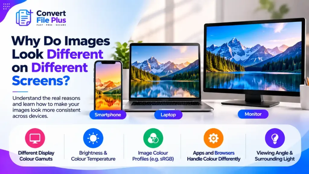
Why Do Images Look Different on Different Screens?
Images look different on different screens because every screen produces color, brightness and contrast in its own way, and the software showing the picture may also read the file’s color information differently. The same photo can look warmer on a laptop, punchier on a phone and flatter in an older app. This guide explains the main causes, separates what you can control from what you can’t, and gives a short routine for exporting images that hold up reasonably well on most devices. It won’t make every screen identical, because nothing can. The five things that change from screen to screen Most mismatches come from a combination of these: The first two are about the device. The third and fifth are about the file, and these are the ones you can actually fix. Display hardware: the same numbers, different light An image file stores numbers. The screen decides what light those numbers produce. Displays mix red, green and blue light, but each manufacturer makes its own color-balance choices, and BenQ notes that mass-production variation means even two units of the same model can differ. Screens also cover different ranges of color, called gamuts. MDN describes three common tiers: sRGB, which covers the vast majority of color displays, Display P3, which is larger and includes sRGB, and Rec. 2020, which is larger again. A wide-gamut screen can show more saturated reds and greens than a standard one. When the software converts the image correctly, an sRGB picture looks as intended on both. When it doesn’t, the wide-gamut screen can show the colors as over-saturated. Even a single screen isn’t perfectly even. BenQ points out that panel uniformity problems can make brightness or color differ between parts of the same screen. Brightness, white point and comfort settings Brightness is often the biggest hidden factor. KTC observes that phones and tablets often run very bright, especially outdoors, which makes the same image look punchier than it does on a dimmer monitor. Comfort features add another layer. Apple’s True Tone adapts the display’s color to the light around you, and Night Shift shifts the screen toward warmer colors after dark. A photo that looks neutral at noon can look a little orange at night on the same device. Blue-light filters, screen protectors and privacy films can do something similar. The room matters too. One photographer’s write-up points out that editing in a dim room can make your screen look brighter than it will to others, which leads to edits that end up too dark elsewhere. Color profiles: the part that lives in the file A color profile is a label that tells software what the numbers in an image mean. The most common ones are sRGB, Display P3 and Adobe RGB. The profile is stored inside the file, or it’s missing. The web has a default for the missing case: CSS Color Level 4 says untagged images are treated as sRGB. Current browsers generally follow this, though other apps may not, and some ignore profiles completely. This is where unexpected shifts appear: If an image looks fine on your desktop but dull after upload, our guide on why images lose quality when uploaded to websites covers the other causes to rule out, such as resizing and recompression. Which cause fits your symptom? Symptom Likely cause What to try Colors look flat after export or upload Wide-gamut file not converted to sRGB, or profile stripped Re-export a copy converted to sRGB with the profile embedded Colors look over-vivid in one app only That app skips color management, or a wide-gamut screen shows unconverted values Open the file in a browser and compare; export in sRGB Brighter or punchier on the phone Higher brightness, auto-brightness, different panel Set similar brightness on both devices before comparing Orange or blue tint at certain times True Tone, Night Shift or another filter Switch it off while you judge color Two monitors on one desk disagree Different panels, settings or calibration Compare at equal brightness; use a calibration tool if color matters professionally Print looks different from the screen Screens emit light, prints reflect it, and the two mix color differently Expect a difference; order a test print Only the converted copy looks different The converter dropped the profile or recompressed the image Compare original and copy on the same screen How to prepare an image for the widest range of screens What you can’t control You can’t set your viewer’s brightness, night mode, room light or panel quality. Some people still use uncalibrated screens, and a few apps ignore profiles. The realistic goal is an image that looks close and credible everywhere, not identical everywhere. Printing is a separate case. Screens emit light and paper reflects it, so even an excellent print will not match the glow of a display. If print matters, make a test print before a large run. Common mistakes Frequently asked questions