
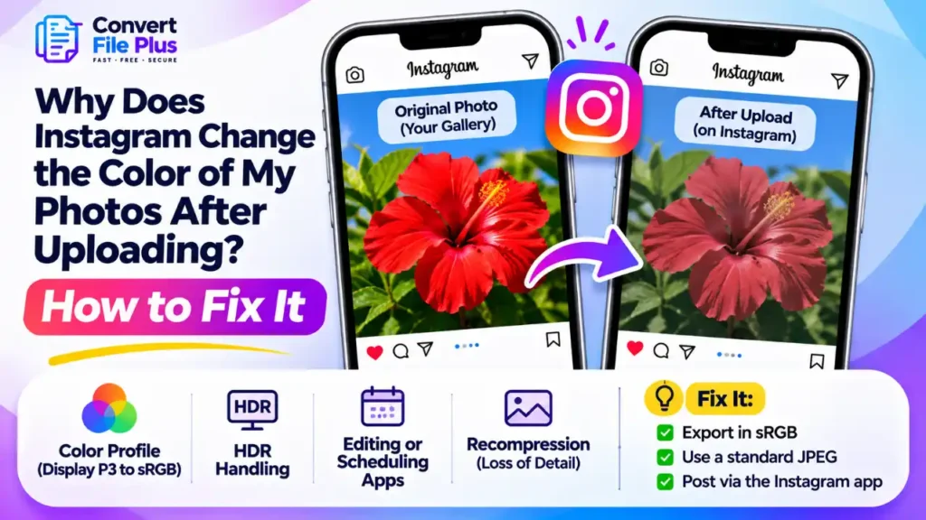
Instagram photos can look different after uploading because of color-profile conversion, HDR handling, third-party editing or scheduling apps, and image recompression. Converting a copy to sRGB is a useful first test, particularly when the color profile is suspected, but it will not fix every type of color change.
These causes look different from each other, and some are outside your control. This guide helps you match what you see to a likely cause, then gives a short export routine. It won’t make every viewer see identical color, because no workflow can.
First, check that the photo really changed
Put three versions side by side on the same phone at the same brightness: the original in your gallery, Instagram’s preview just before posting, and the published post. Switch off True Tone, Night Shift or similar comfort features while you judge.
If the original and the preview already differ, the change is happening on your device. If only the published post differs, it’s happening during or after upload. Then open the post on a second device or a desktop browser. If it looks different from screen to screen, you’re partly seeing display differences, which our guide on why images look different on different screens explains.
Color range: the most common cause
A color profile is a label that tells software what the numbers in an image mean. Most web images use sRGB. Many recent phones capture and display Display P3, a wider range. Apple’s documentation notes the extra range is most noticeable in reds and greens.
When software converts a wide-gamut image to sRGB, some colors may appear less saturated, particularly bright reds, oranges and greens. In the other direction, sRGB values shown without conversion on a wide screen can look too vivid.
Here is an illustrative example, not a test result. A red jacket that glows on an iPhone screen may look more muted once its color is mapped into the narrower range.
Instagram has handled wide color on iPhone for years. Its engineers described adding support in 2017, and they stored a wide-color and a standard version of each image, serving whichever suited the viewer’s device. That 2017 account doesn’t tell us how the pipeline works today. It does show that two people can legitimately see different versions of the same post.
Older Adobe community reports said Instagram on Android handled Display P3 files poorly. We could not confirm whether that still applies, so test on your own phone.
Third-party tools add another variable. The scheduler Sked says photos with an embedded P3 profile look less vibrant when posted through it, and recommends sRGB.
HDR: the newer cause
Instagram and Threads added HDR photo support in 2024, according to Meta’s engineering blog. HDR photos carry extra brightness information, and a viewer that can’t show it fully has to adapt the image.
Photographer Greg Benz, who writes extensively about sharing HDR photos, reports that Instagram uses gain-map JPEGs and that some native iPhone captures lack the needed map. Forum threads describe photos from newer iPhones looking brighter or harsher after posting. Instagram hasn’t confirmed a cause for those reports, so treat HDR as a suspect, not a verdict.
If brightness, highlights or contrast changed more than the hues, test HDR first.
Which cause matches your photo?
| What you notice | Likely cause | What to try |
| Reds, oranges or greens look duller | Wide-gamut profile (Display P3 or Adobe RGB) mapped into sRGB | Export a copy converted to sRGB with the profile embedded |
| Photo looks brighter or harsher, mostly on a recent iPhone | HDR handling | Post an SDR (standard dynamic range) sRGB copy and compare |
| Looks fine posted from the app, off through a scheduler | The scheduler’s handling of profiles | Use an sRGB export; compare against a direct post |
| Looks different on friends’ phones, not yours | Different screens, or a different served version | Compare at equal brightness on several devices |
| Gradients look blotchy and skies look banded | Recompression | Start from a cleaner original; avoid re-saving |
| Whole feed looks different at night | Night mode or True Tone | Turn them off before judging |
How to export a copy that holds up
- Work from a copy. Keep the original untouched.
- Convert the copy to sRGB and embed the profile. In Photoshop’s Export As and Save for Web dialogs, “Convert to sRGB” and “Embed color profile” are separate options, and Adobe community experts advise ticking both. Other editors word this differently, so check yours.
- Export a standard JPEG at a sensible size. Our guide on why Instagram photos look blurry after upload covers sizes and the quality setting.
- If you suspect HDR, use an editor that exports a standard-dynamic-range version. Avoid export options labeled HDR or “with gain map.”
- Post directly from the Instagram app first. If a scheduler is involved, compare the two results.
- Compare again, changing one thing at a time. Otherwise you won’t know which step helped.
If your source is a HEIC file and you need a JPG copy to edit or test, the ConvertFilePlus HEIC to JPG converter handles the format change. The page doesn’t say how it treats color profiles, so compare the result with the original before posting.
What you can’t control
- Viewers’ screens, brightness and comfort settings.
- Which version of your image Instagram serves to a given device.
- Instagram’s own changes, since its pipeline can change without notice.
Posting is also hard to undo cleanly. Deleting a post to re-upload loses its likes and comments.
Common mistakes
- Judging by the profile grid thumbnail instead of opening the post.
- Comparing photos at different brightness levels. Check the original and uploaded version on the same device with consistent display settings.
- Re-saving the same JPEG through several apps, which stacks compression.
- Posting screenshots of a photo, which adds a second round of compression.
- Over-correcting. Boosting saturation to fix one device often breaks the photo on others.
Frequently asked questions
Conclusion
Start by working out whether the change is dull, bright or app-specific. Then export an sRGB copy and compare it with the original on the same phone. If it still looks off, the cause may be a viewer’s screen or Instagram’s side, and neither is something you can fix from your end.

- What Is DPI in an Image? Does It Affect Image Quality on Screen and Print? - November 15, 2026
- Why Does WhatsApp Reduce Photo Quality? How to Send Images in HD - November 11, 2026
- Why Does Instagram Crop My Photos When I Upload Them? How to Fix It - November 9, 2026